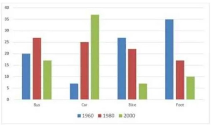
The following bar chart shows the different modes of transport used to travel to and from work in one European city in 1960, 1980 and 2000. Summarise the information by selecting and reporting the main features and making comparisons where relevant.
The bar chart illustrates the four modes of transport used to travel to and fro from work to home in one European city from 1960 to 2000. Overall, Car is leading highest mode of transport preferred in the year 2000 while in the year 1960, the Foot is most widely transport. The data are predicted in percentage.
To begin with, Bus shows the fluctuations in the choice of the transport this accounted for 20% in 1960, above 25% in 1980 and then fall in the figure to around 17% in 2000 respectively. At the same time, Car depicts the remarkable increase of around 30% between 1960 and 2000 in the usage of car facilities by the people of a European city.
On the other hand, Foot shows opposite trend then the Car mode, proportion of people going by walk to workplace decreased from 35% in 1960 to just 10% in 2000. Similarly, the decline figures depicted by Bike accounted for a decrease of 20% over a period of 30 years.
Follow Us on IELTSTrend Twitter
Also read: Information About the Country of Birth of People Living in Australia


Leave a Reply