


The pie chart below shows the proportion of different categories of families living in poverty in the UK in 2002. The proportion of people from each household type living in poverty. Summarise the information by selecting and reporting the main features, and make comparisons where relevant. Write at least 150 words.
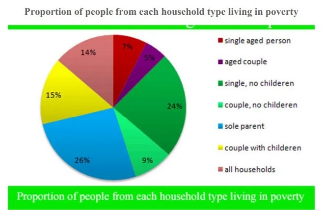

The pie charts demonstrate seven different categories of a single aged person, an aged couple, single no children, the couple no children, sole parent, couple with children and all household of family’s proportion who was living in poverty in the UK in 2002.
Overall, most sole parent and single, no children types households lived in poverty or pernicious. However, the proportion of the number of aged group households was minor. All households were also the second lower proportion.
The majority of household type living in poverty was sole parent people account of 26% while, couple, no children had only 2% less proportion than sole parent type household. Only 5% proportion aged type household which was also lowest household in 2002. single, no children people had only 9% who lived in poverty.
Couple with children and all household people ratios was almost same with 15% and 14% respectively—7% single aged person living in poverty in the UK in 2002.
Follow Us on IELTSTrend Twitter