Academic Writing Task 1 Sample 2 – The given pie charts compare the expenses in 7 different categories in 1966 and 1996 by American Citizens. Summarise the information by selecting and reporting the main features, and make comparisons where relevant.
Sample answer of Academic Writing Task 1 Sample 2 — The given pie charts compare the expenses in 7 different categories in 1966 and 1996 by American Citizens
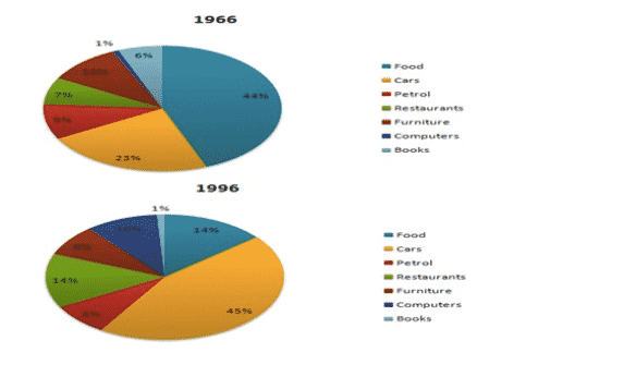
The following pie chart illustrates the compassion about 7 different categories during 1966 and 1996 by the American people. Overall the American spent most of the income on food at least on computers in 1996. However, in 1996 the majority of the expenses were on the can and the least on books.
Food was the main expense of the Americans during 1966 having a share of 44 %. Following it was the expense of cars with a share of 23%. Americans spent the least on the computers and mode were equally on the restaurants and petrol the expense on furniture was around 10%.
As compared to 1966 the preference of the Americans slammed drastically. The car constituted the major share of the expenses in 1996. It was around 45% of the total expense. Surprisingly the books saw the least spending by the American it was a mere 1%. the expense of the restaurants was 14 % which was 6% more at the expense of petrol. The furniture constituted a reasonable share of 8% of the expenses. However, the computer now has a share of 10% which increased substantially as compared to 1966.


The given pie chart compare the expenses in seven different categories in 1966 and 1996 by American Citizens. Summarize the information by selecting and reporting the main features and make comparisons where relevant.
The Above pie chart measures the differences between expenditure incurred for 7 different categories of countries for two distinct years (1966 and 1996) by Americans residents.
Overall, the Americans nationals spend the highest proportion of their income on food whilst counterparts spend less of its income on food. The expenses incurred on cars rose significantly in the preceeding year while the latter spend less on cars. The Significant features will be discussed in the following paragraphs.
As can be seen, the highest percentage of expenses spent on food and cars was estimated at 44% and 45% while the lowest proportion can be seen in 1966 and 1996 respectively.
Between 1966 and 1996 the amount of disbursement incurred on food hit a peak approximately and dipped down respectively. On the other hand expenses incurred on books and computers was slightly lower and dropped to 0 and 1% respectively.
However cost incurred on petrol and furniture at both years remained unchanged whilst expenditure incurred on restaurants rose significantly to 14% and averaged approximately.