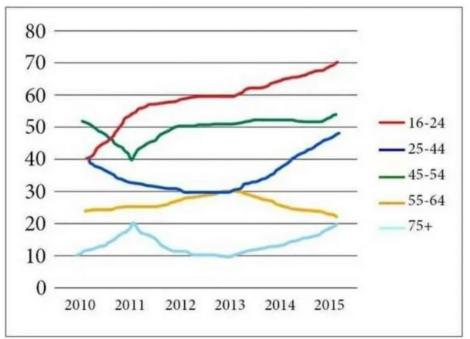
The Graph below shows the percentage of people in different age groups in one city who attended music concerts between 2010 and 2015. Summarise the information by selecting and reporting the main features and making comparisons where relevant.
The line chart provides information about how many people of five various age groups went to a music show in a particular city; data is given in percentage over the five-year period from 2010 to 2015.
Overall, every age group had a rising trend in the last few years except 55-64-year-old masses and younger age attended more music concerts than any other group.
As can be seen from the illustration, people who were in the age category of 45-54 engaged more in music concerts, just over a half. The ratio of young and mid-age individuals had a similar number, exactly 40%, As well as least proportion of individual people who were aged more than 75 attended merely one-tenth, this percentage inclined gradually by 10% after a year but again reached to one-fifth after four years.
Moving further, 45-54 age group visited less in 2011, after that this percentage grew up after a year and levelled off through the period, roughly 55%. Whereas, the younger aged group also rose throughout the period and reached to the high point to 70%, as well as this percentage was more than other age categories. Music concert visitors from the age category of 55-64 went up, however in 2013 had the opposite trend, and had around 20%.
Follow Us on IELTSTrend Twitter


Leave a Reply