The pie charts below show the average household expenditures in a country in 1950 and 2010. Summarise the information by selecting and reporting the main features, and make comparisons where relevant.
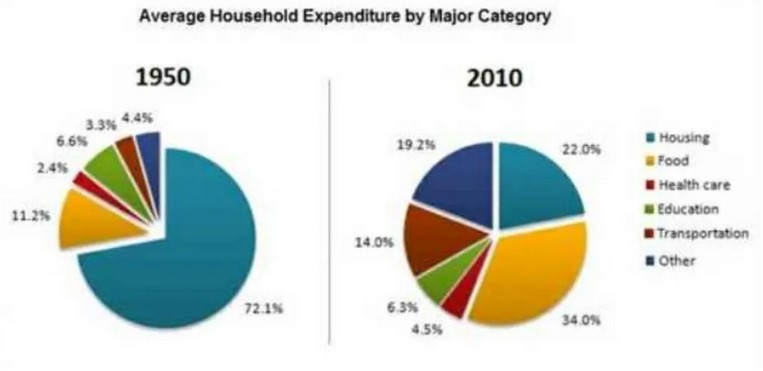
The pie chart illustrates the average household expenses in a country from 1950 to 2010.
over all the expenses of the household has increased with the record.
The major form of expenses during 1950 was housing, which occupied 72.1 % of the household’s total expenditure. Still, now it has declined and come to 22% of the average household expenditure in 2010. whereas the major expense of 2010 is the food category which earlier was 11.2 % and now it is 34%.
Along with food and Housing, all the other areas of the household budget has also increased this including Health Care from 2.4 % to 4.5 %, transportation 3.3% to 14% and others 4.4% in 1952 in 19.2 % in 2010.
Among all the necessities education was the only category which saw a decline of 0.3 % over 6 decades install increased the burden on a family Survival by increasing the expenses on the basic needs of a family.
Follow Us on IELTSTrend Twitter
Also read: Describe an Intelligent Person You Know